
 |
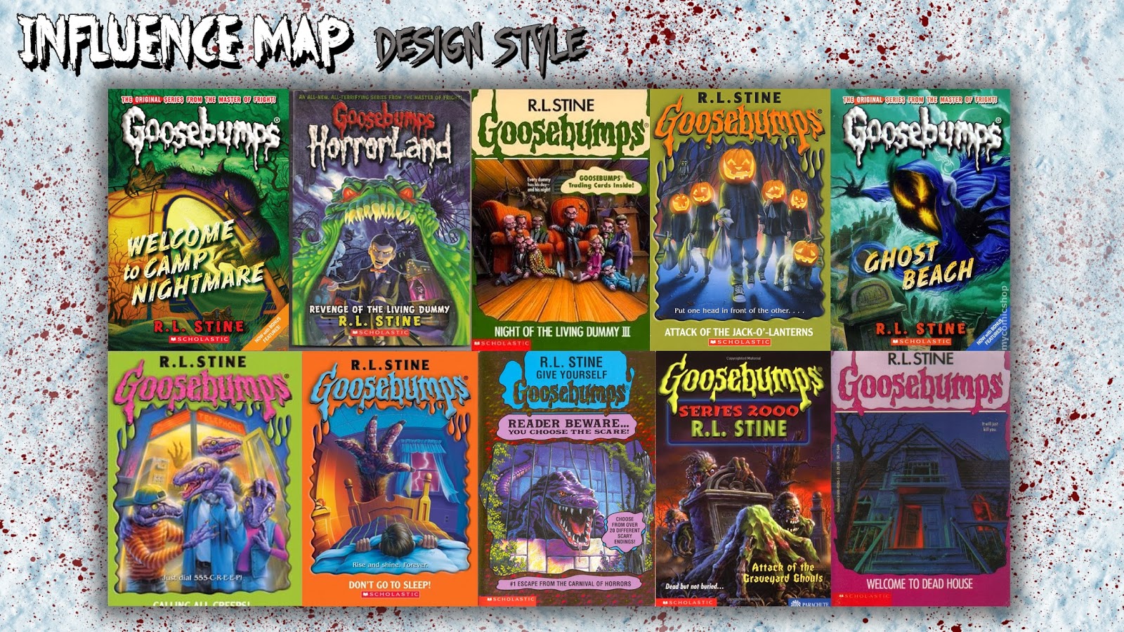
| Goosebumps: There have been many different illustrators for R.L Stines' Goosebumps books. Looking at the design of the covers I noticed that there is no more than about 4 colours being used in each illustration, as well as dark black lines to make it look more like a comic book style. |
 |
| Scooby-Doo: I never noticed before but the backgrounds of Scooby-Doo use mainly one colour and just uses different tones of each colour to create light and shade. As well as this there are good use of shapes to give it a creepy look. |
 |
| Even though the exterior of the school will not be the final piece, I decided to look at castles, chateaus, private schools and lunatic asylums (as described in the book) to get some inspiration and also narrow down the era. |
 |
| Using the description of the school interior as a guide, I searched various images to help me piece together something in my head. |
No comments:
Post a Comment