
Sunday, 24 February 2013
Friday, 22 February 2013
From Script to Screen: Other Environment Concepts
Speed paints using the silhouette style again.
 |
| The Red Pit Challenge |
 |
| The Spooky Kiosk |
Wednesday, 20 February 2013


Saturday, 16 February 2013

Friday, 15 February 2013
From Script to Screen: Final Character Concept Art
Instead of having just black and white which would be dull and boring to me, I had an idea to make the three areas in Death's world have a distinctive colour tint each which would then reflect on to everything else such as Death himself and Jerry.
Green tint - Jerry arrives and Death is behind the Kiosk - illusion of feeling welcome
Blue tint - The Cemetery and Death is the Grave Digger - cold creepy atmosphere
Red tint The Chasm and Death is the Ring Master - shows tension and fear
Unsaturated completely when in his true form, Death drags Jerry into the Underworld.


Wednesday, 13 February 2013

Tuesday, 12 February 2013
From Script to Screen: Environment Design
I like the idea of having Death's world change completely in appearance from the real world to an unsaturated silhouette world. I still can't decide on whether to have it black and white or just one unsaturated colour.


Monday, 11 February 2013
Maya Tutorials: Pre-Viz
Custom Camera Rig

Pan Shot
Pan Shot from Alex Edmonds on Vimeo.
Roll Shot
staircase roll 180 from Alex Edmonds on Vimeo.
staircase roll 360 from Alex Edmonds on Vimeo.
staircase roll 540 from Alex Edmonds on Vimeo.
Pitch Shot
Pitch Shot Start from Alex Edmonds on Vimeo.
Dolly Shot
Crane Shot
Distance Shots
Coverage
Final Edit
Camera Shakes
Contra Zoom
Sunday, 10 February 2013
Friday, 8 February 2013


From Script to Screen - Draft Storyboard
On page 2 the red squares are alternative. I could not decide whether I wanted Death at a desk or at a kiosk at the time. But now I think the kiosk is best.


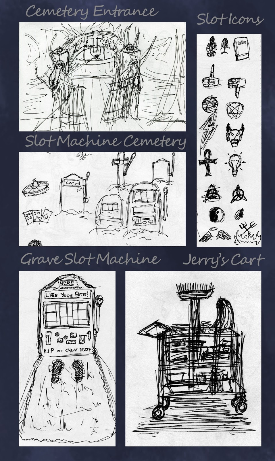
From Script to Screen - Thumbnails/Doodles for Environment, Props (Grave Slot Machine) and Death In His True Form
My grave slot machine has become more of a prop in terms of design than the light bulb so I did some sketches of it as well as icons for it to have on the rollers. The cemetery entrance is just a basis at the moment, I need to get into some concept painting to show the true look of it. Still working on the chasm.

 |
| First thought of Deaths true appearance but it is still too "Grim Reaper" I think. |
Thursday, 7 February 2013
From Script to Screen: Character Design - More Jerry Sketches
So after being informed that my former sketches of Jerry looked like a paedophile I went and did another page of sketches mainly focusing on his face to make him look a bit younger and more appealing to the audience. Personally I like 15. Generally I like the thin head shape but I did different nose shapes as well.

Number 5 accidentally became blind.. I did not mean to do the black of his eyes so big so tried to make them into shades...
Sunday, 3 February 2013

Saturday, 2 February 2013
From Script to Screen - Character Design: Janitor Jerry
I always wanted the character to have a hunchback and to be thin and gangly. The first page was my initial thoughts on the character but it wasn't what I wanted so I did further developments.
 |
| Initial Design |
 |
| 1 looks very peculiar but I was trying to identify the style on this sheet. |
 |
| Looking more at faces on this sheet, I like 15 best. |
From Script to Screen - Character Design: Death
With the fact of there being a casino world in mind, I thought about having Death be dressed in different outfits. For some reason my mind ran off on the idea of there being a cemetery looking place to begin with as well but I don't think I'll have that now. Afer drawing 4 versions of how Death looked the most popular at the time seemed to be 2 and the fact he has no face.
Grave Digger - For Cemetery
Casino Croupier - For Casino
Ring Master - For Tight Rope Walking
Ring Master - For Tight Rope Walking

Subscribe to:
Comments (Atom)